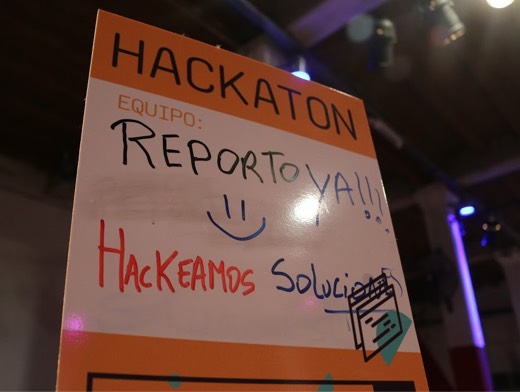
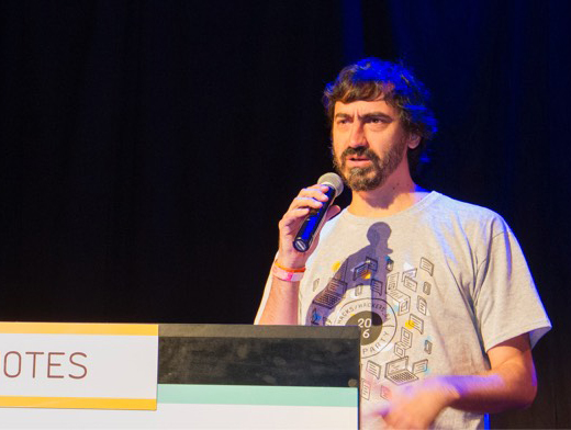
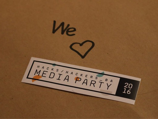
The challenge ahead called for some truly disruptive ideas. We decided to take a minimalistic path and see where it led when applied over a flat color palette, trying out a series of different looks for the brand.
After an extensive exploration stage, we finally arrived at a logo that felt right for a community of hackers. We coupled that with a sleek color palette and…boom! We’ve got ourselves a brand. We were so happy with it that we applied it on pretty much everything we could think of.
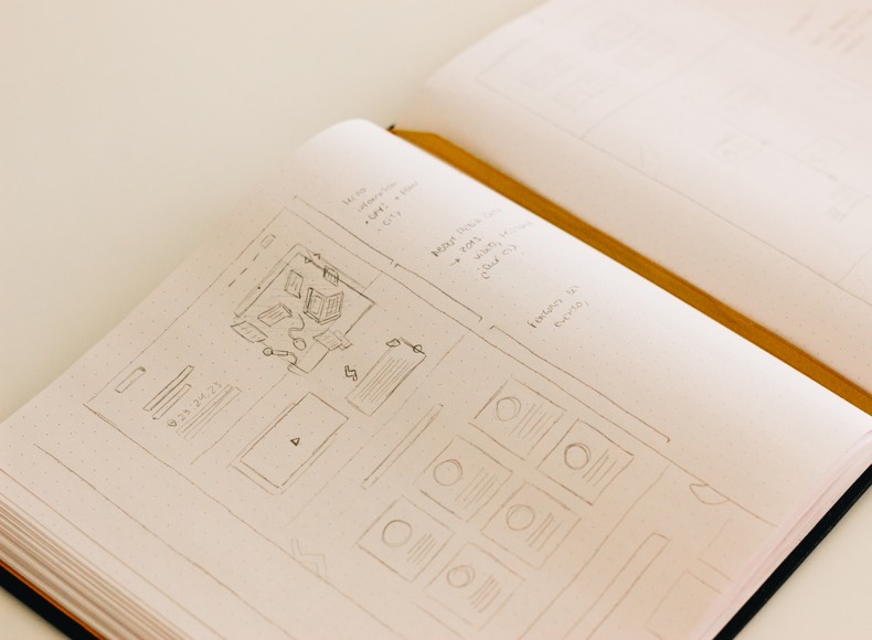
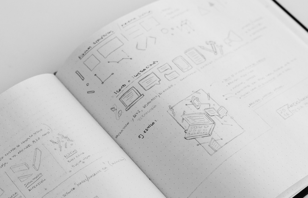
With a brand in hand, it was time to take the concept even further and put together a landing page that coupled the unique identity of Media Party with the bulk of information users would need for the event. As always, we started on paper and built up from there.
What did users think of MediaParty 2016?
Spoiler alert: they loved it.
Este es el ambiente del hackaton en la #MediaParty2016 #hhba pic.twitter.com/x3WgJMlBDd
— Girolabs (@Girolabs) August 27, 2016
Tremenda convocatoria #hhba pic.twitter.com/nrEGkIpTrZ
— tocateunvals 🍄 (@tocateunvals) August 27, 2016
Así cerramos la #hhba Media Party 2016.
— Hacks Hackers Bs As (@HacksHackersBA) August 27, 2016
Gracias a los que hicieron posible el evento productivo más grande de Latam! pic.twitter.com/Srcdf8imqs
Emocionada de ver tanto programador trabajando con #PanamaPapers @ICIJorg en #MediaParty2016 Resultados pronto!! pic.twitter.com/IiCwiOuZEg
— Mar Cabra (@cabralens) August 27, 2016