Kaspersky Lab

Icons work together as an outline of the corporate identity.

Apr 2014 - Jul 2014

01

The_Client

It is one of the fastest growing Information Technology companies in the world, adding 150,000 new clients every week. Kaspersky Lab offers a wide range of security software for threats in different devices, based on knowledge and experience in malware.

+200

Countries

+300M

Users worldwide

4th

In the IDC Ranking

02

The_Challenge

Users had a great number of products to choose from, but it was hard for them to identify the different solutions each one offered and to correlate the products to one corporate visual identity. We decided to face the challenge as well as to present a solution for potential new products.

Kaspersky Lab needed to

Build

A brand Identity

Our strategy

Design

A symbol system

&

Set

The basis for future products

Make

it scalable

03

The_Approach

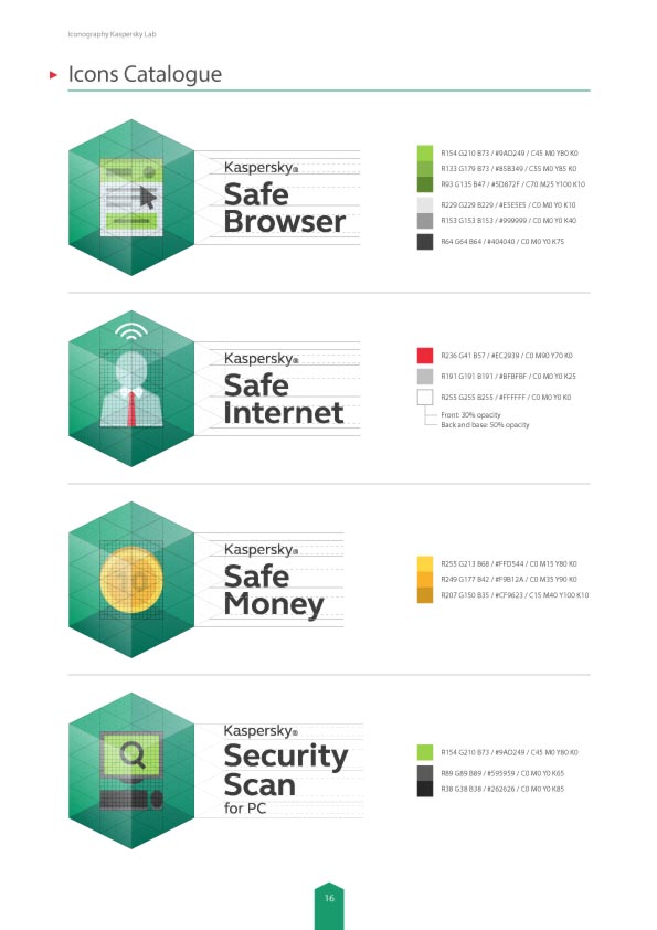
Each product was represented through memorable icons resembling a shield in the form of a box that safeguards the element stored inside, to communicate protection and security.

Illustration & Iconography

Sketching Process

We brainstormed to find concepts that represent the names of each product.

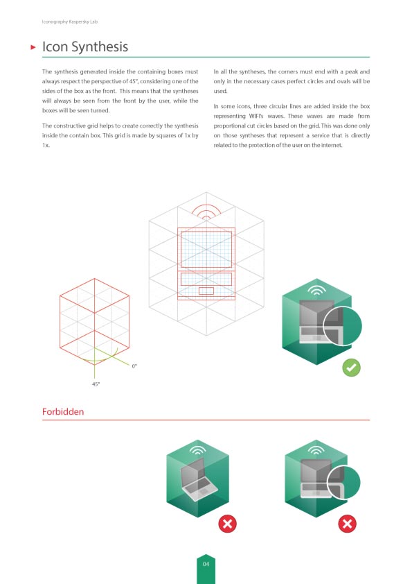
Constructive Grid

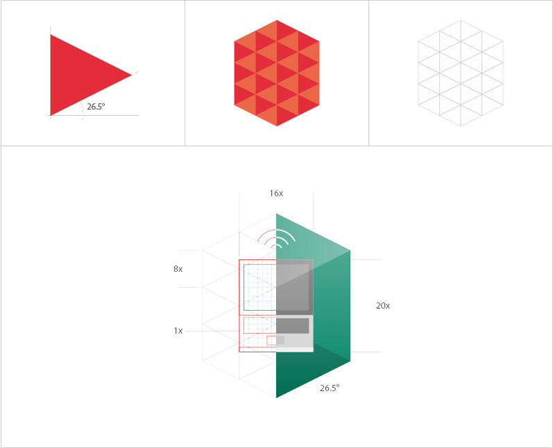
A red arrow, part of the brand identity, was used as reference to build a grid for the subsequent use of the icons system in future products.

kaspersky logo construction

Color Scheme

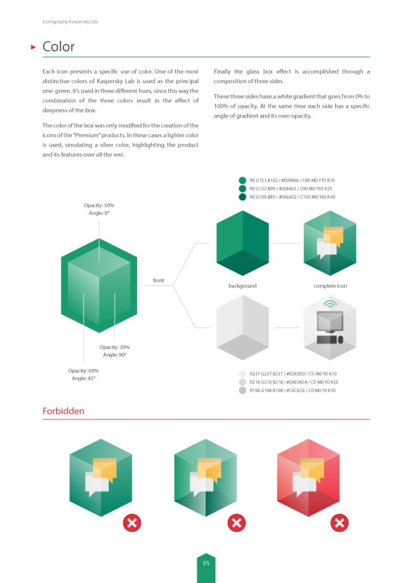
The Green soul of Kaspersky Lab was reflected in each icon. For premium product icons, grey and silver colors were used.

kaspersky color scheme 1 kaspersky color scheme 2
Opacity: 60% _ Angle: 45° Opacity: 50% _ Angle: 0° Opacity: 30% _ Angle: 90°

One color.
Three Tones.

Two colors.
Two tones apiece.

Three colors.
Different amount
of tones.

Typographic system

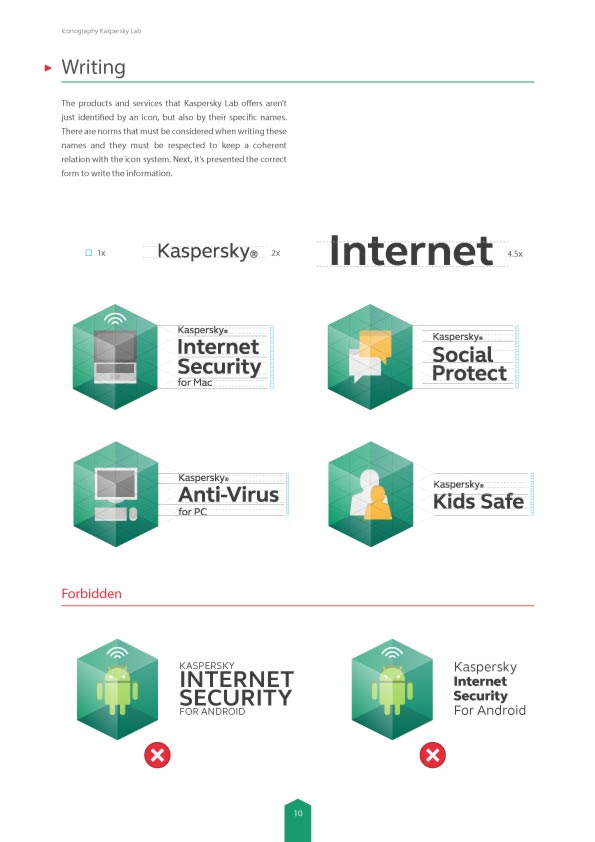
Different typographic grids were designed in the length of the name of each product.

kaspersky typography example AaFS Elliot Pro Regular AaFS Elliot Pro Bold
kaspersky typography applied example 1 kaspersky typography applied example 2

Minimum Size

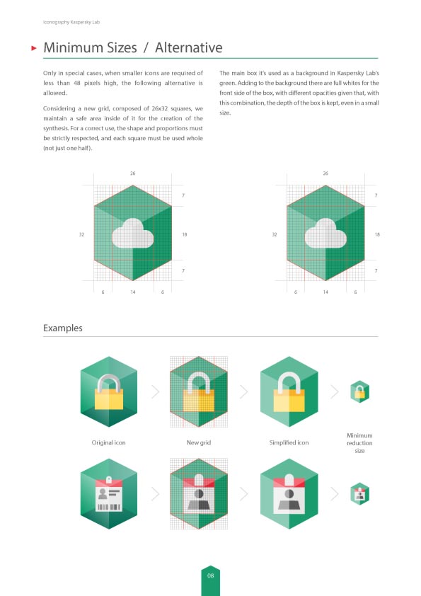
Starting from a grid formed by 26x32 squares, we kept a safe area inside the boxes to introduce the icons. In addition, we simplified colors and details for a better display.

kaspersky icons minimum size 1 kaspersky icons minimum size 2 kaspersky icons minimum size 3 kaspersky icons minimum size 4

Guidelines

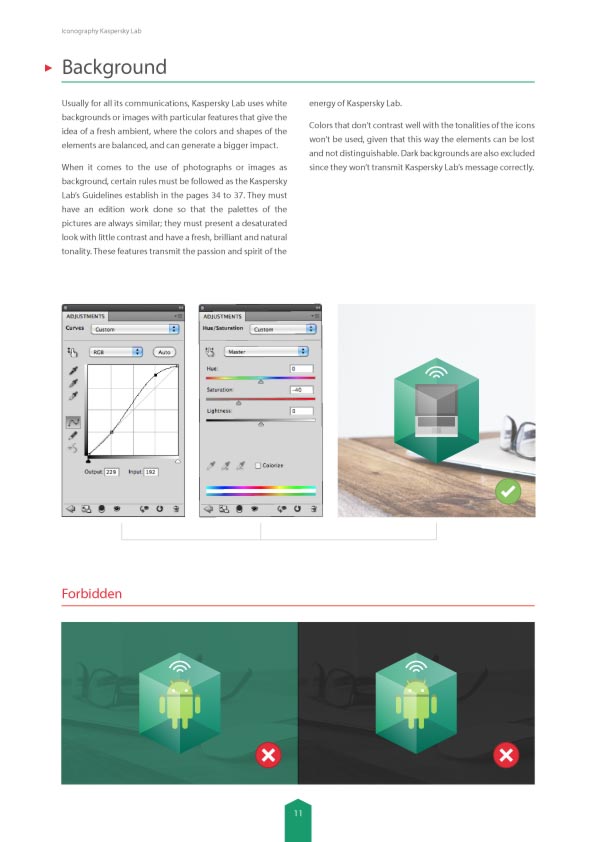
In order to keep a neat icon system across all of the company’s channels and platforms, we put together a comprehensive guide to iconography that sets outs rules, boundaries, and good practices for crafting icons within this brand.