Banco GaliciaMobile App Design

Redefining mobile banking

Banco Galicia set out to be the first bank in Latin America to offer a truly satisfying mobile experience to their customers. They approached Aerolab with the challenge of updating their platform for Android and iOS, creating a simple and compelling experience for a user-base of over 1 million people.

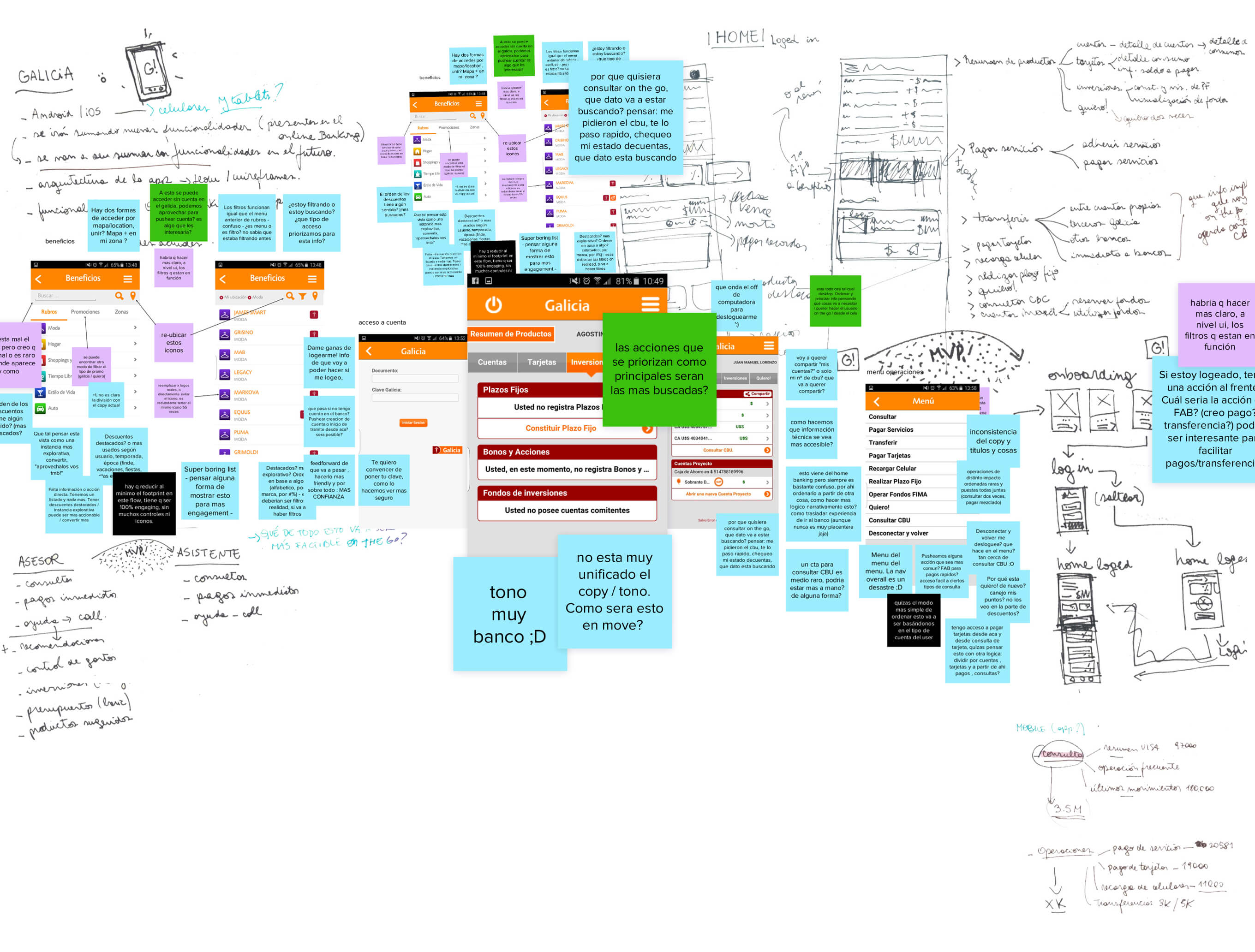
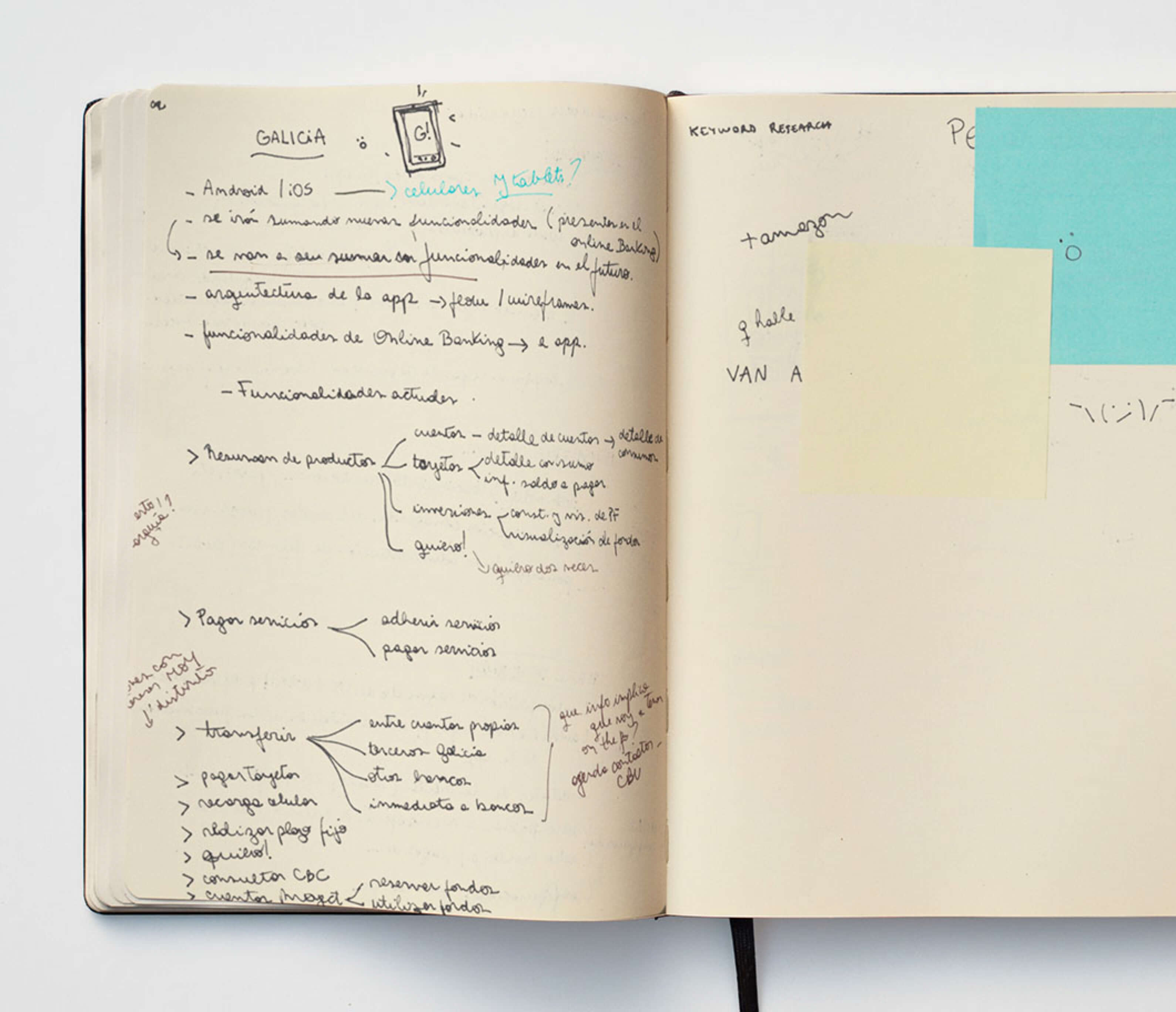
More sketchings of the app on a notebook

Paper first

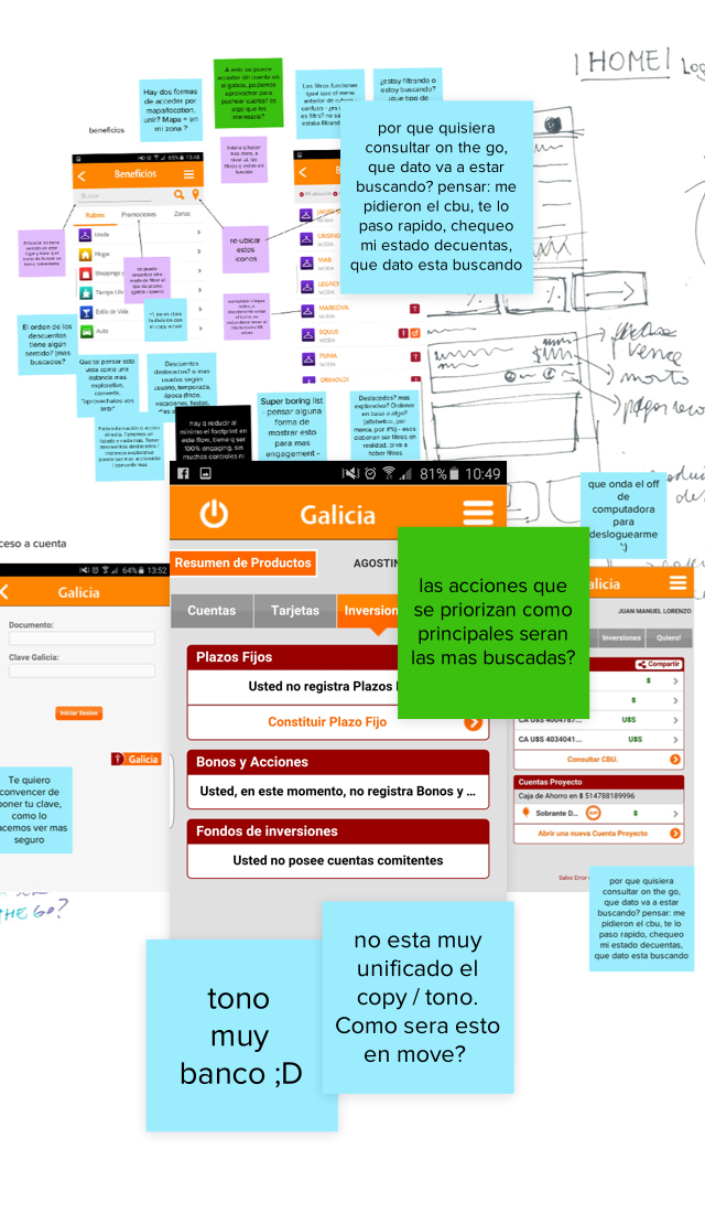
The initial stage of the project revolved around de-constructing, dissecting, and inspecting every instance of the mobile banking experience. We wanted to gain a comprehensive understanding of the gap between what the users needed and what the service offered before coming up with a new approach. You wouldn’t believe how much we spent on post-its.

Post-its and ideas for the app Post-its and ideas for the app

Organize & Simplify

The flow in the old app was designed based on how the banking system works, rather than on how users think. Our main challenge here was to translate the process and make it feel more human.

Organize ideas to simplify them Organize ideas to simplify them

A year of wireframes

If we were to re-think mobile banking we had to come up with, validate, and test a series of hypothesis. We needed to gain an in-depth insight of users, their language, and their thought processes. Only then we would start making wireframes.

Organize ideas to simplify them

UI: ANDROID & IOS

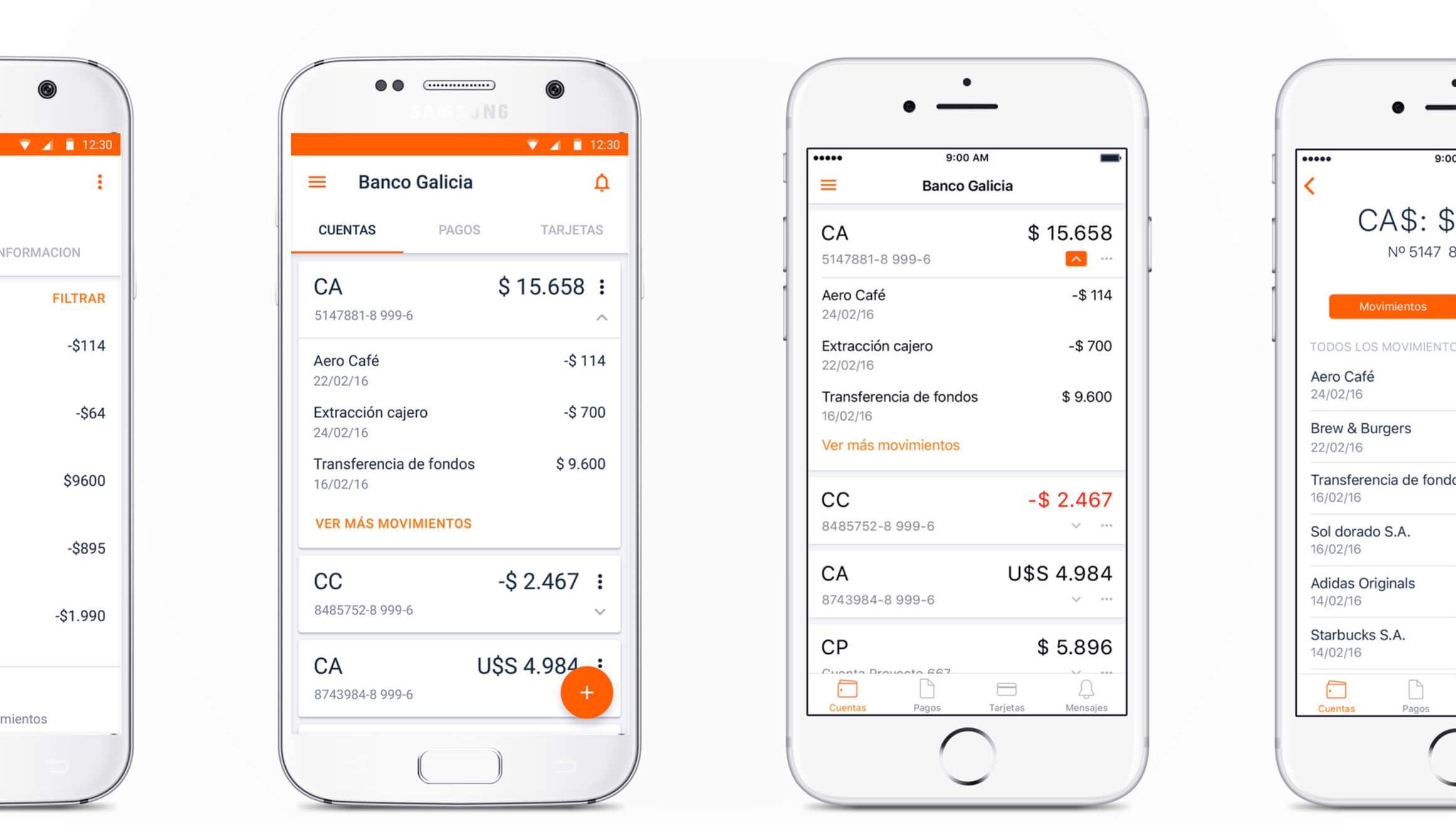
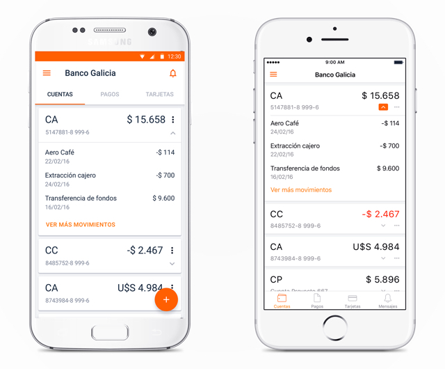
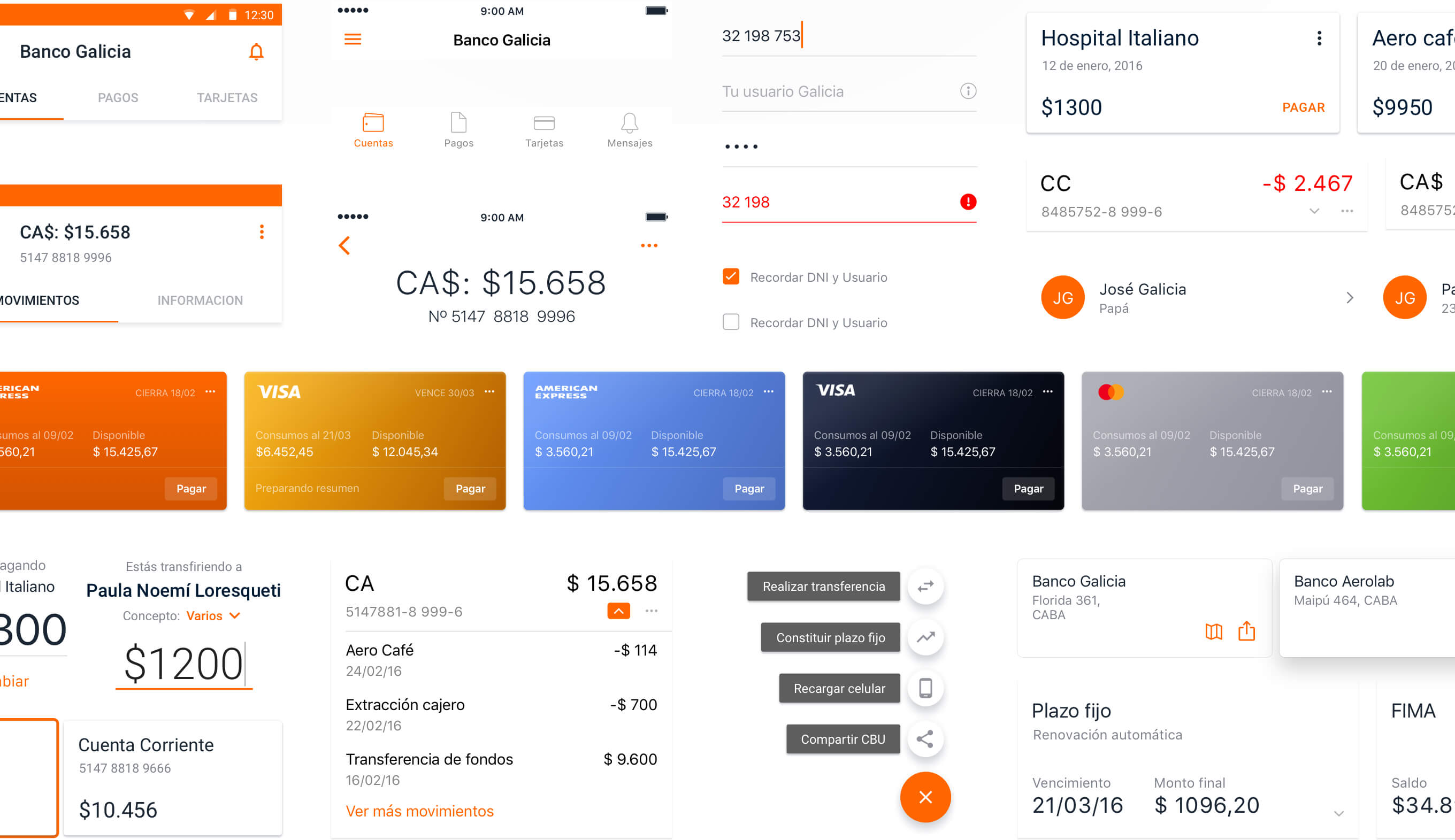
Screen captures of the app on Android and iOs Screen captures of the app on Android and iOs Screen captures of the diferent components of the app on Android and iOs Screen captures of the diferent components of the app on Android and iOs

ICONS

Three segments, two Operative systems, one App.

On top of designing a clean, solid product for iOS and Android, we were also tasked with adapting it to offer a distinctive experience to each of the Bank’s User Segments.

Masivos
Eminent
Move

MOTION UI

BOOM