123seguro Landing Page Design

Get insured, easy as 1, 2, 3.

01

The_Client

123 Seguro is one of Argentina’s first insurance startups. Founded in 2010, their goal was to improve the experience of acquiring an insurance by reducing the time and money typically invested by customers. They were first to market at that moment, and they continue to lead the Argentinian online insurance industry to this day.

236K

Quotes

+30K

Sold Insurance

N°1

Recongnized by google

02

The_Challenge

They had already built an impressive user base. The next step was to give these users a unique, memorable experience. We needed to simplify the purchase process and re-design the site so it would align with the company’s identity and the users’ standards.

123seguro needed to

Shorten

The distance with users.

Our strategy

Increase

approachability

&

Simplify

The purchasing process.

Improve

Usability

03

The_Approach

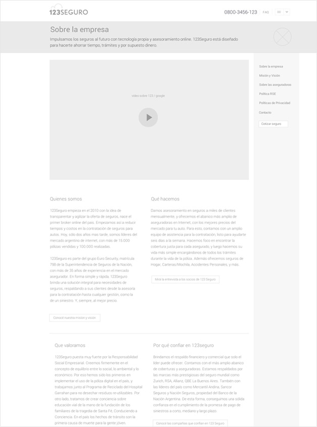
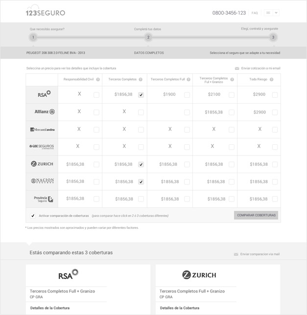
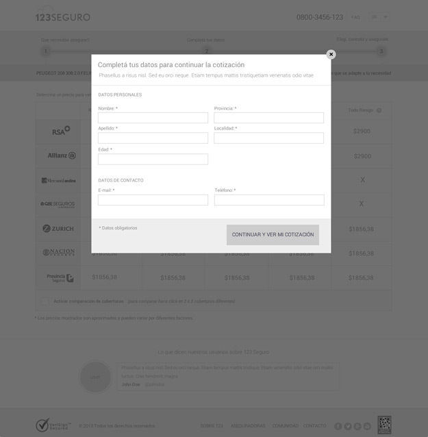
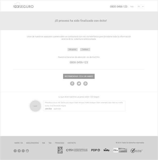
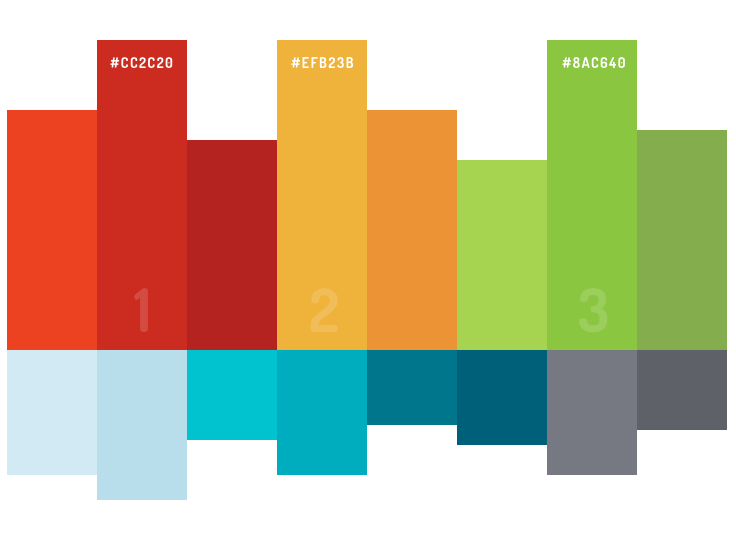
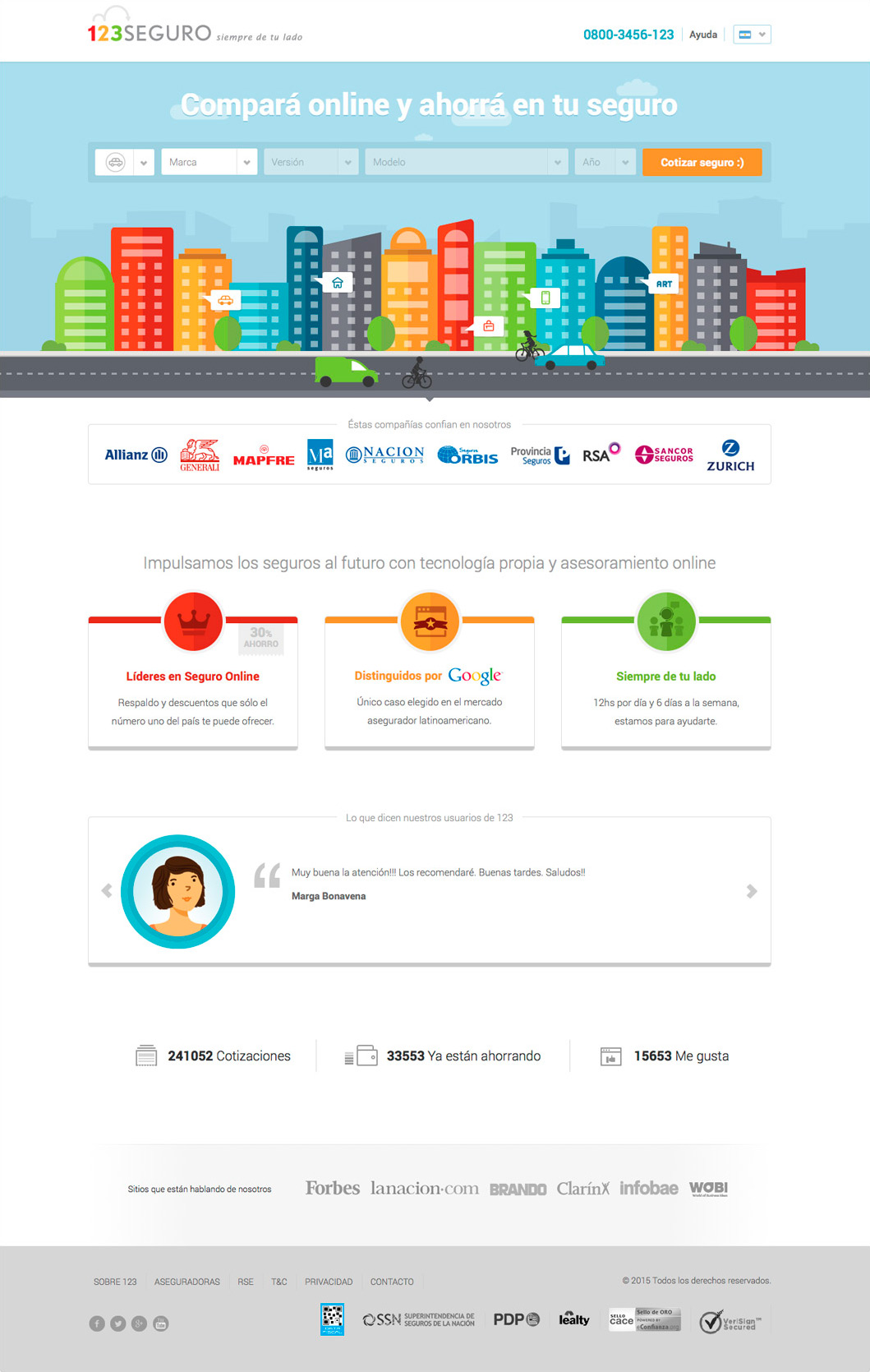
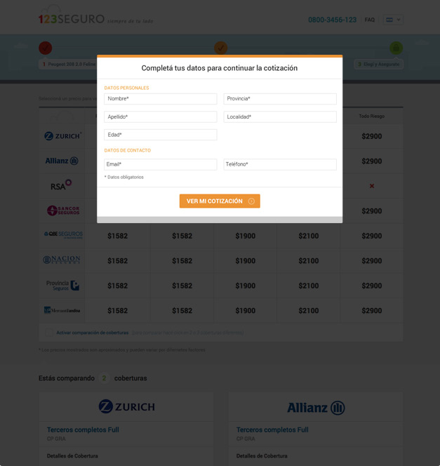
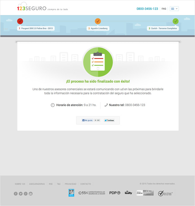
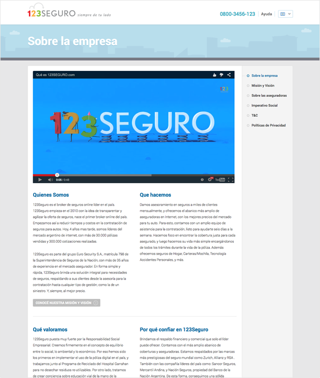
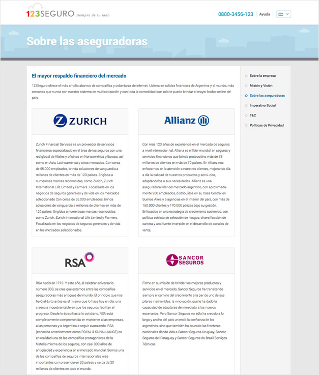
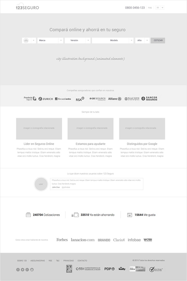
We expanded the brand’s palette and applied it to the whole website, splashing it on the new icons we designed specially for this project. A simplified form featured in the landing page, a step-by-step guide, and a series of improvements to compare services more effectively were key to build an overall better UX.

WEBSITE DESIGN

xapo Wallet
Lemon Wallet

Searching and comparing process

xapo Wallet
Lemon Wallet
Lemon Wallet

Color scheme

Lemon Colors

User interface

Xapo Home
xapo Wallet
Lemon Wallet
xapo Wallet
Lemon Wallet
Lemon Wallet

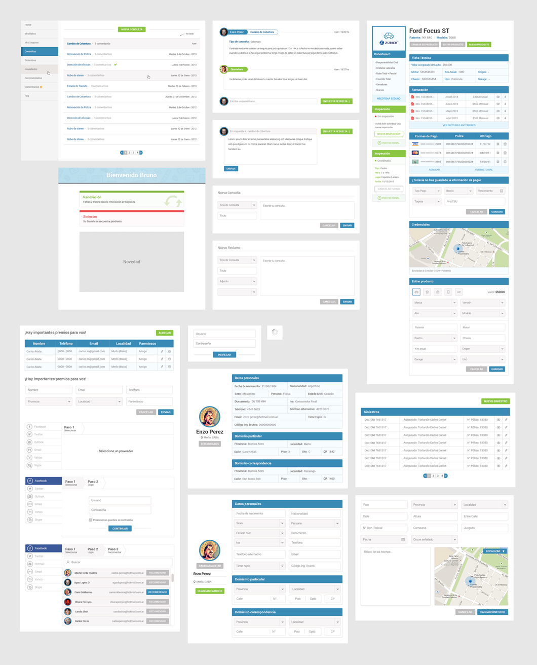
Backend UI kit

Big site, small devices

Iconography

We devised two icon categories to help users get a better understanding of what they could expect from each section.

Insurance Types

Gridalicious

Information Sources

Gridalicious

ILLUSTRATIONS

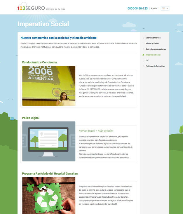
We also created an illustration system that applied the revamped identity colors for both the main site and the RSE section.

ACCESSIBILITY

We made the overall experience much smoother, regardless of which device is used to access the web, by implementing a fully responsive site.

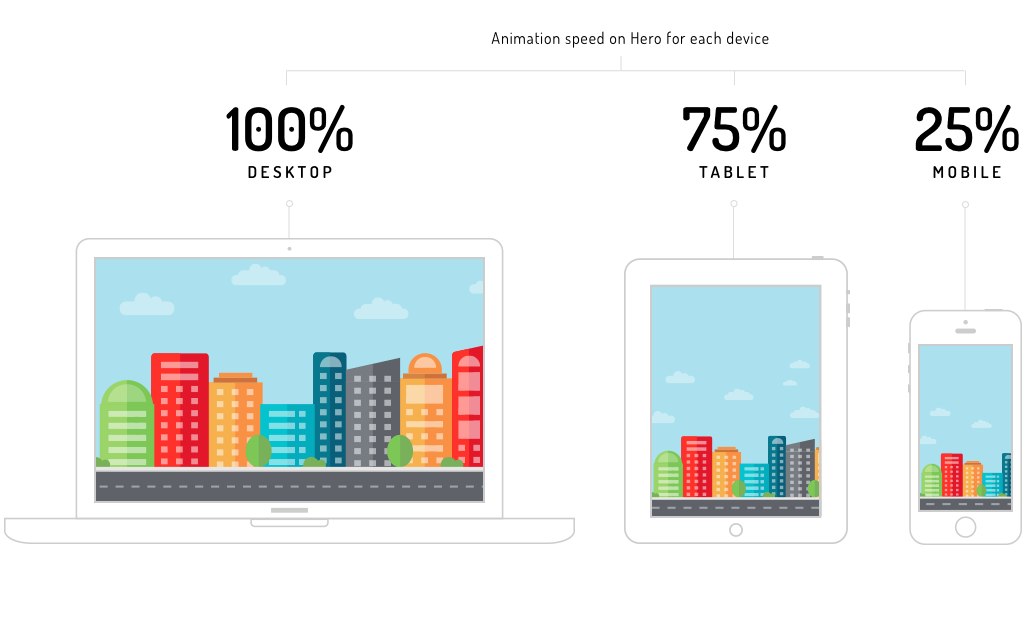
A LIVING CITY

Cars, clouds, and bicycles slow down according to screen size, to maintain proportional speed and to make it feel real.

04

End_Result

Launch the site

A friendly, responsive website that makes users want to learn more about insurance and makes it much simpler for them to make a purchase in a matter of minutes.